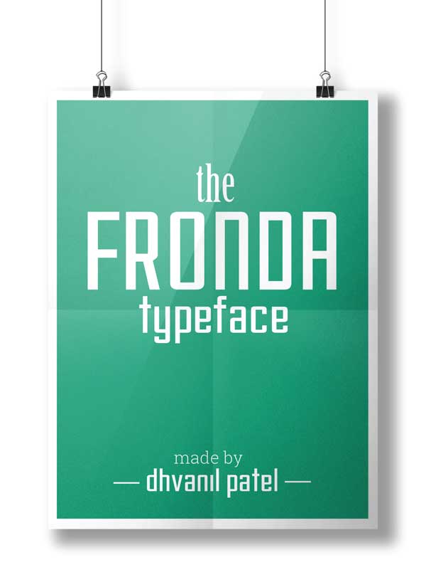
Introduction
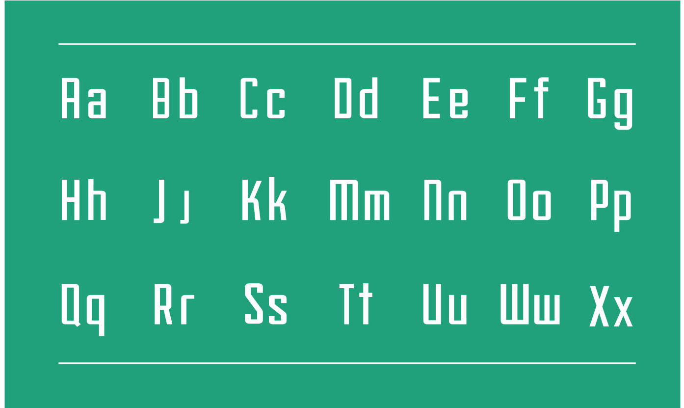
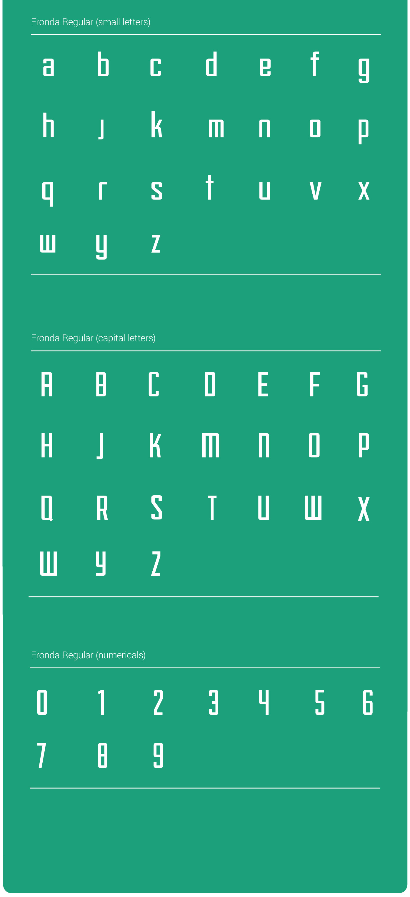
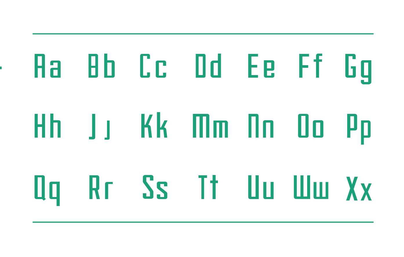
The overall motivation of font came in when I was watching rigid, monospace font (somewhat!), and I realised a need for a typeface which combined those features with humanist touch. 'Fronda' was born with such an idea.
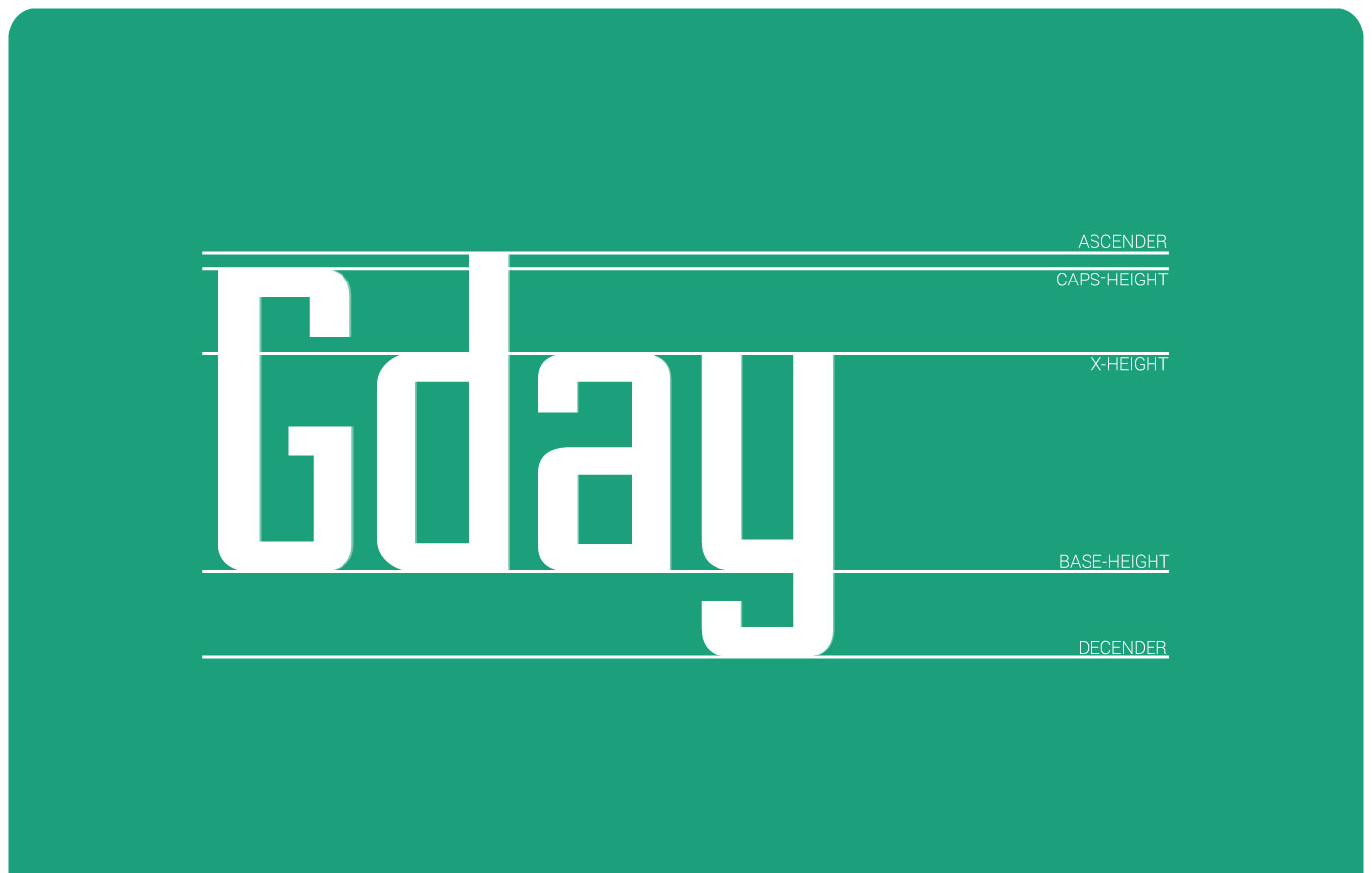
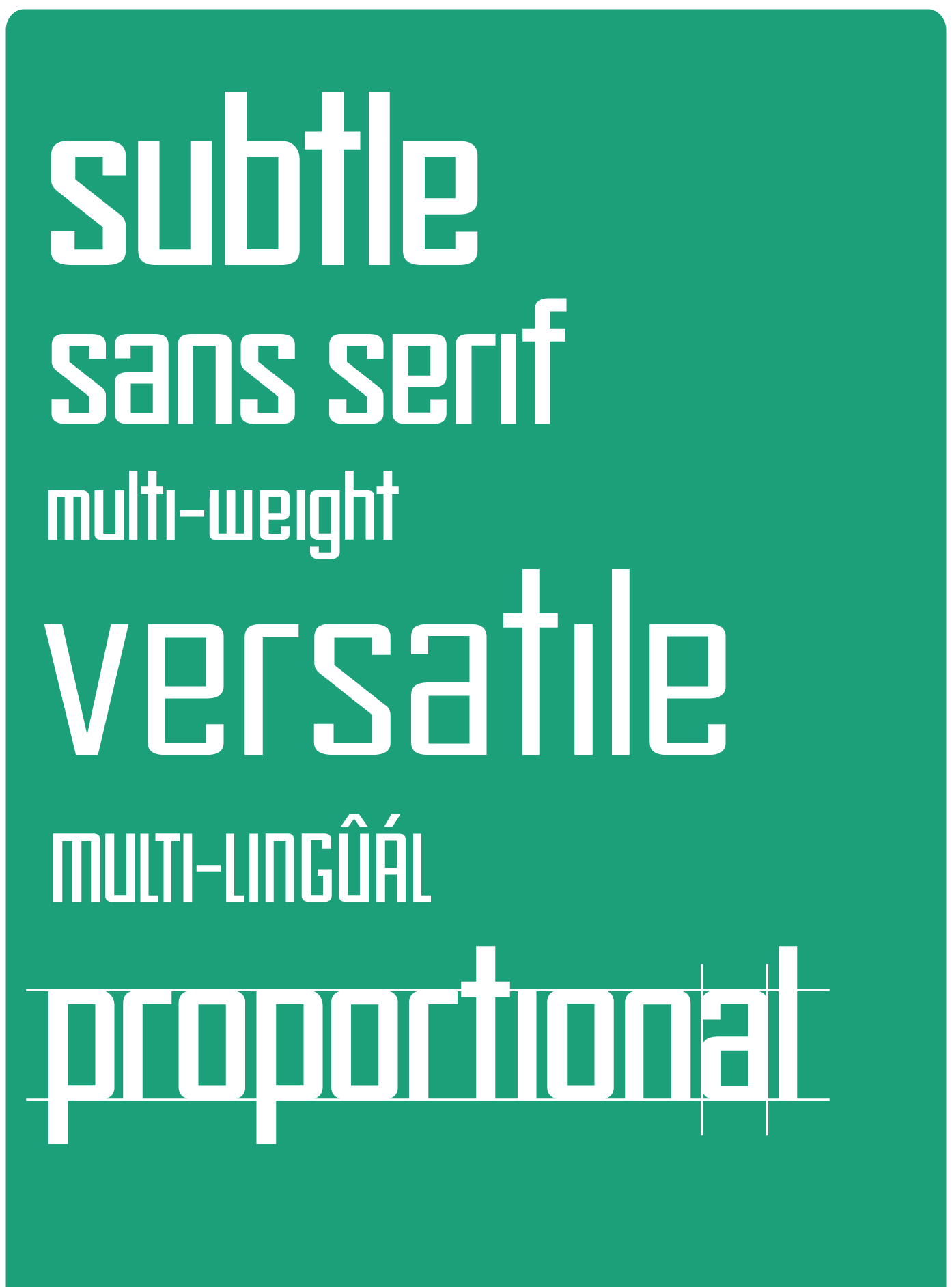
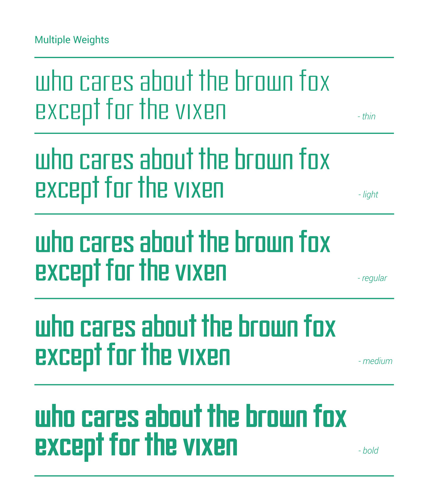
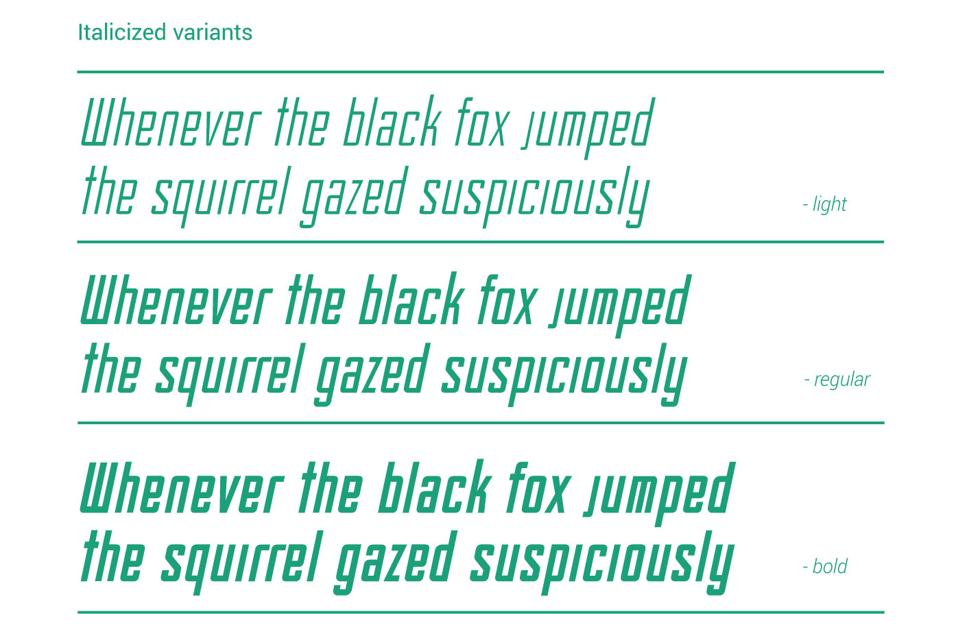
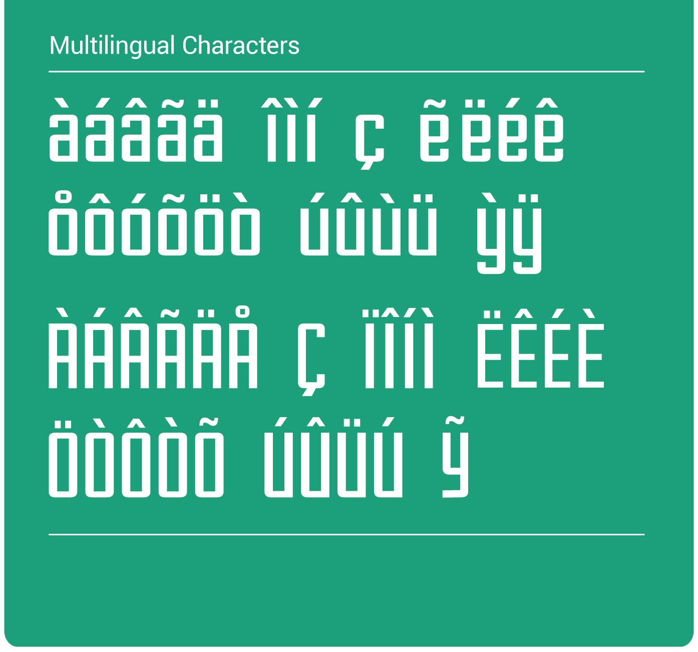
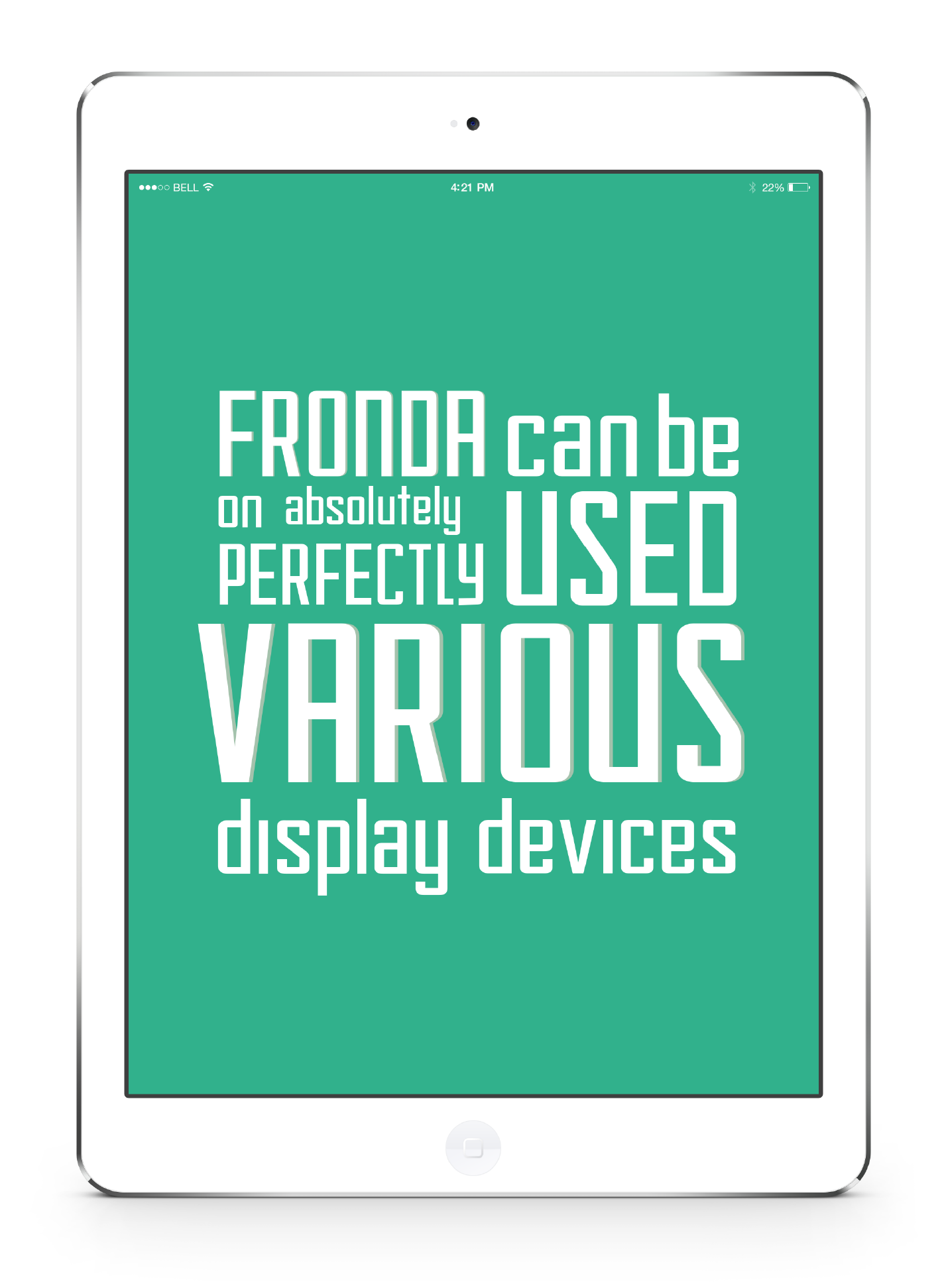
The subtle characteristics of the font makes it legible and easy to read at low font sizes. The typeface is multilingual, with extended latin glyphs. Fronda typeface comes in eight weights.
Created in a span of about two months, this font would be released commercially shortly. The final finishing touches are pending. Stay tuned.

 >
>