Introduction
A choropleth map is a thematic map in which areas are shaded or patterned in proportion to the measurement of the statistical variable being displayed on the map. It provides an easy way to visualize how a measurement varies across a geographic area or it shows the level of variability within a region.
The term "choropleth map" was introduced in 1938 by the geographer John Kirtland Wright in "Problems in Population Mapping".
Choropleth maps are based on statistical data aggregated over previously defined regions (e.g., counties), in contrast to area-class and isarithmic maps, in which region boundaries are defined by data patterns. Thus, where defined regions are important to a discussion, as in an election map divided by electoral regions, choropleths are preferred.
All the data used in this project can be found in this TopoJSON file. If you are interested in the raw data, you might be interested in these ShapeFiles
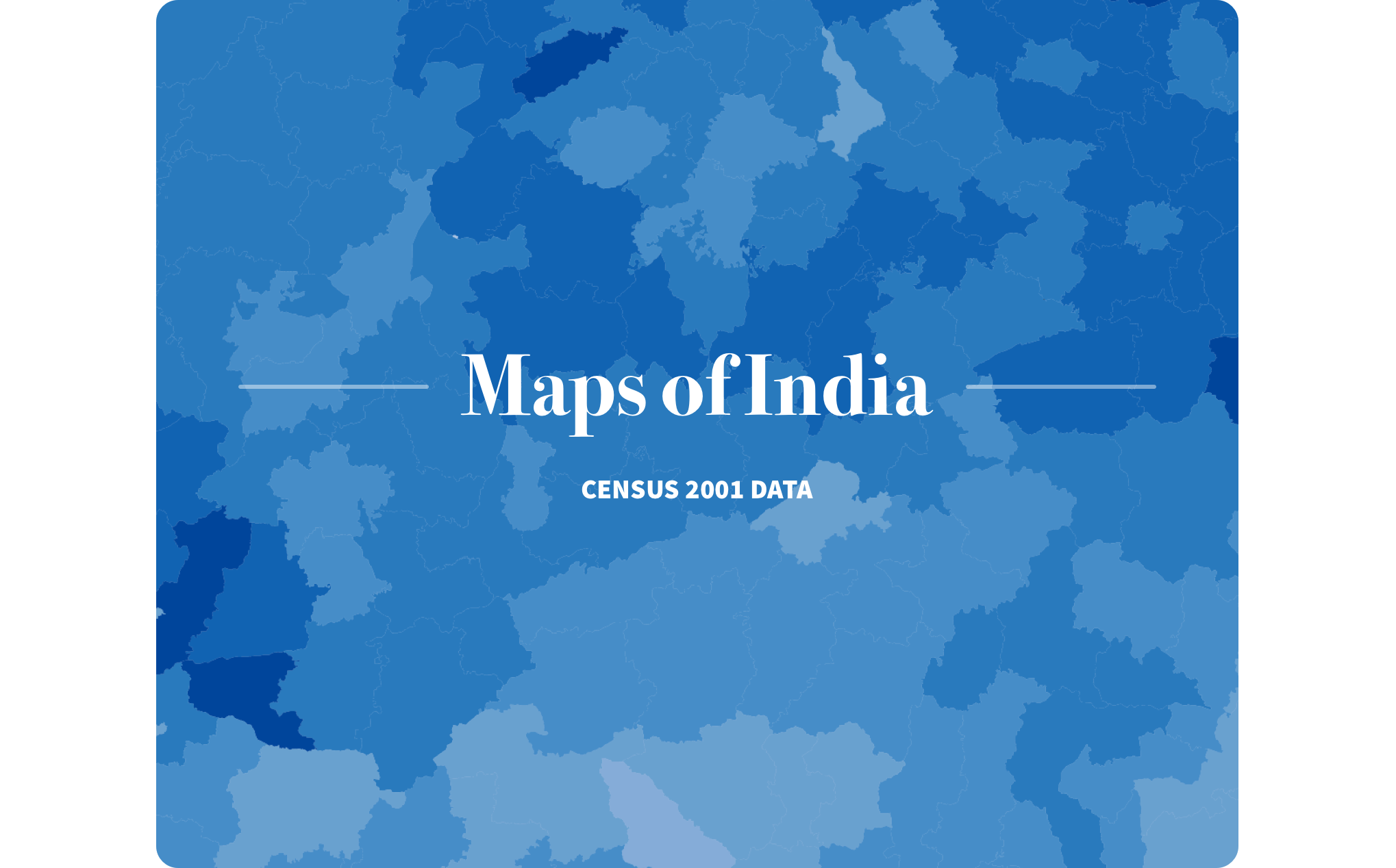
I was trying to make a data visualization on the Rape Statistics in India after coming across a very thorough dataset which had district wise data for recorded crimes against women.
However, the GeoData file and the dataset didn't match (GeoData file was of 2001 census while the dataset was based on 2013 data) Additional districts had been created during the time and many local boundaries were redrawn.
Hence, I put it on hold and worked on these Choropleth maps. The data visualized here is based on different HDI parameters. There were 598 districts in India during 2001.
For the choropleth maps, I've used quantized colors from ColorBrewer. ColorBrewer is a color specifications guide developed by Cynthia Brewer. You can check it out at colorbrewer2.org. It is an extremely comprehensive and useful utility for developing choropleth maps.
Literacy rate per district
The first map shown below is the one where the literacy rate per district has been visualized. The color scheme used here is the 9-class RdBu ColorBrewer palette.
Absolute Population per district
Below is the choropleth map for absolute population per district. The color scheme I've used here is the ColorBrewer 7-class YellowGreen. This kind of a color scale is purposefully since the Yellow color slightly highlights the non-populated areas so as to make the entire map slightly more visually balanced. Also, the variation amongst the highest and the lowest populated districts is too high (which cannot be captured on a 7-class scale) For example: the highest populated district is Medinpur with population of over 9.6 million while the lowest populated district is Lahul and Spiti with a population of just about 33,000 (difference of nearly 9.6 million)
Average Household size per district
Below is the choropleth map for integral average Household size per district. The darker regions are the ones where the family size is large. There is a very distinct difference between the northern and southern parts of India in terms of average household size, which can be partly explained on the basis of culture, tradition etc. The color scheme I've used here is the ColorBrewer 7-class Greens.
Scheduled Castes per district.
Below is the choropleth map for percentage population of Scheduled Castes per district. The color scheme I've used here is the ColorBrewer 9-class OrangeRed. The data is from the 2001 census.
Scheduled Tribes per district.
Below is the choropleth map for percentage population of Scheduled Tribes per district. Darker regions are the ones where the the percentage of ST population is larger. The color scheme I've used here is the ColorBrewer 9-class Greens. The data is from the 2001 census.
Infant Population per district.
This is the choropleth map for the percentage of infant population per district. Infants are considered as children below the age of 6. Darker regions are the ones where the infant population is larger. The color scheme I've used here is the ColorBrewer 9-class Blues. The data is from the 2001 census.
I hope you found this project interesting. All the data used in this project can be found in this TopoJSON file. Other resources: ShapeFiles & GeoJSON file.
To convert ShapeFiles to GeoJSON & TopoJSON format, I used Shape Escape
For visualization purposes, a JavaScript visualization library: d3.js has been used.
The data I've used is from 2001 census. It will be updated it once I find the ShapeFiles for the new districts which were created during 2001-2011.
 >
>